Parking Rangers
Branding enemy lines.
Challenge
When the nature of your job is facing general-public–disapproval and anger, how do you create a brand to help curb some of the hatred and show your service-oriented attitude? Parking Rangers needed help to shift public perception to being more approachable and friendly, without appearing weak—rules are rules, after all.
Results
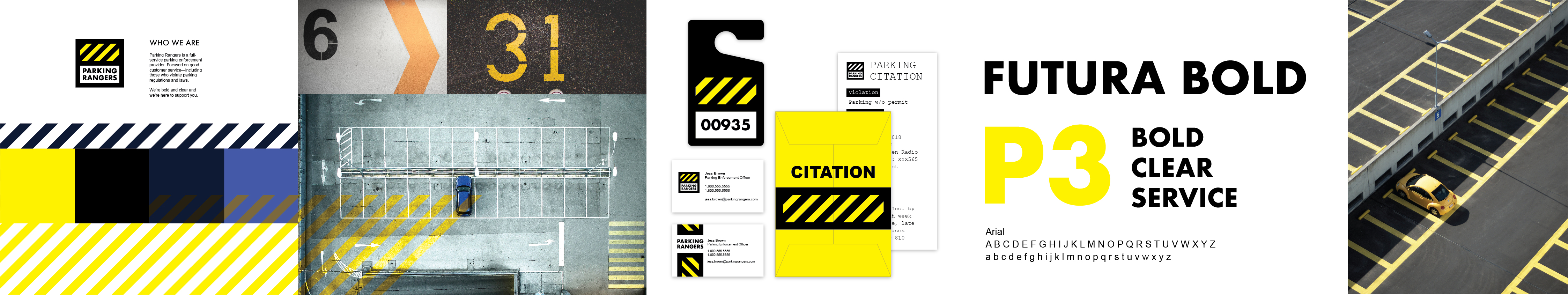
No more, "hiding in the bushes," this tactical brand strategy is about being open, bold, and clear. With a bold color palette, a clean website design, new messaging, and simple collateral, Parking Rangers is changing their outlook to be more serviceable and friendly.
Summary
Parking Rangers is a parking enforcement services company.
- Identity
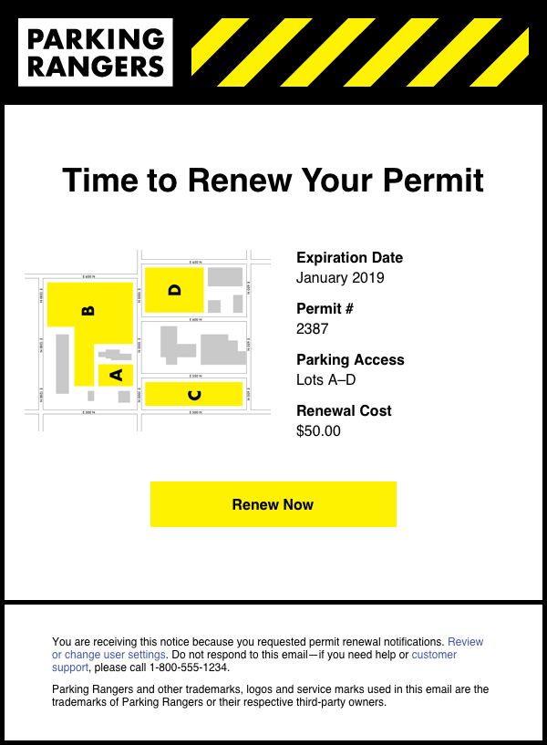
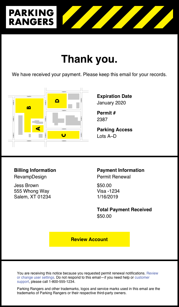
- Email Templates for Permit Renewal System
- Brand Collateral
- Website
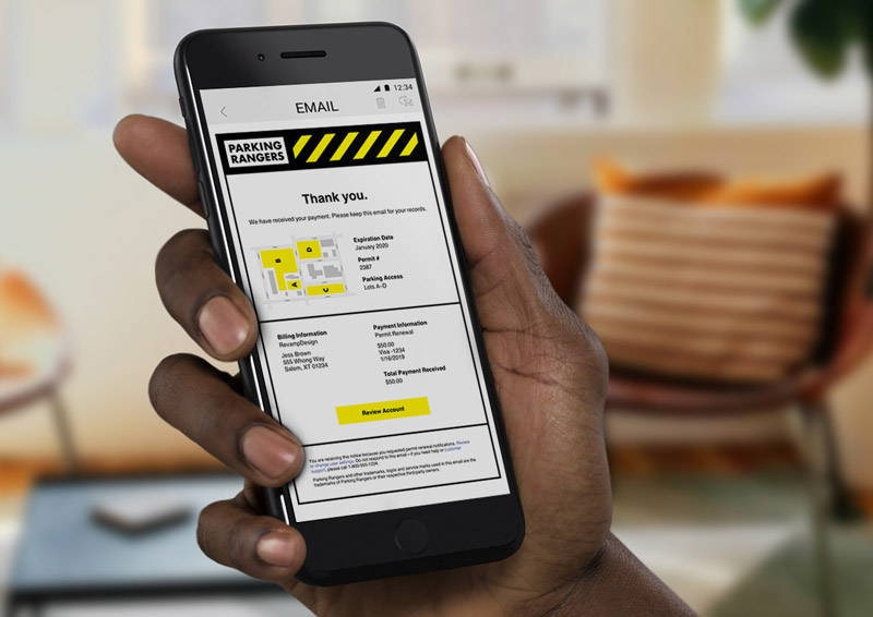
Easy maintenance for customers.
After defining the brand imagery, tone, colors, and fonts with the stylescape, we began tackling the customer experience (those who need parking permits). A quick win for Parking Rangers was creating a simple email system for renewal reminders and digital receipts.
Deeper dive.
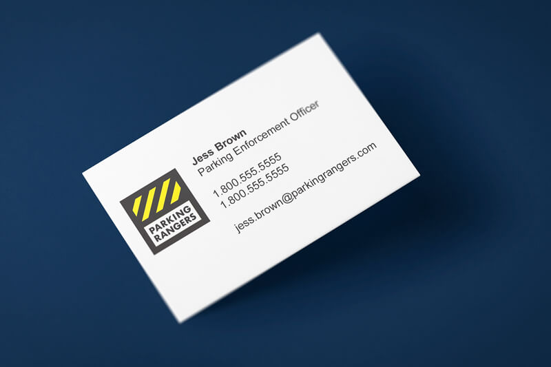
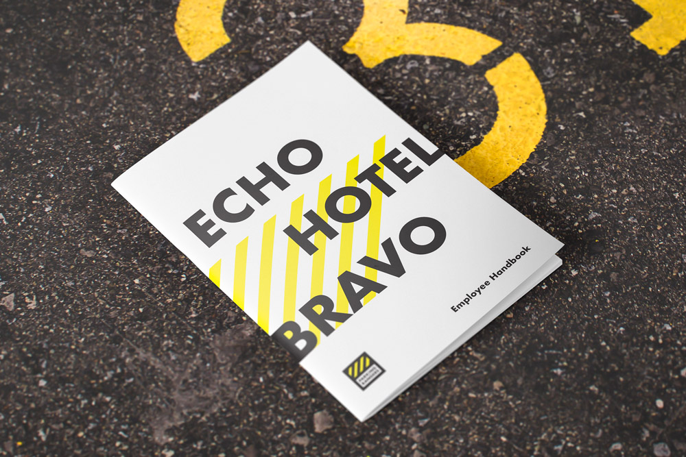
Parking Rangers wanted a consistent brand and identity design that extended beyond the email touchpoint. Now that the customers were being reached, it was time to focus on the employees. Business cards and the employee handbook needed to be sharp if they were ever going to be used.
Time for some empathy.
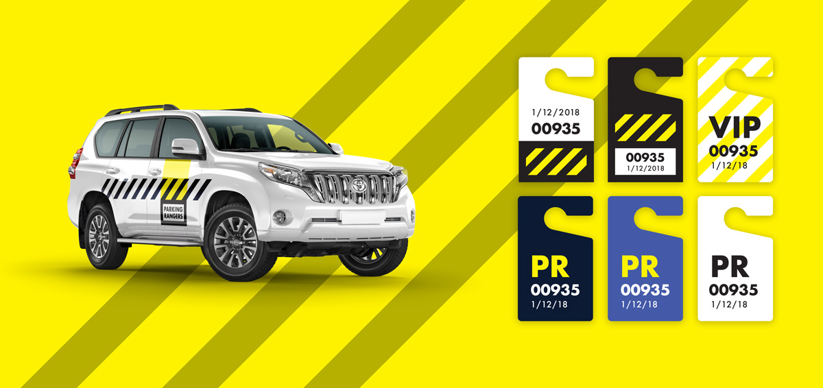
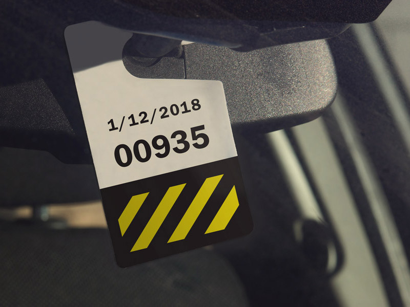
There's nothing more frustrating as a parking enforcement officer than poorly designed hang tags—what lot does it say? When does it expire? Contrast is key when looking at hang tags—and even the placement of the text is important. No matter how many times you remind customers where and how to place the hang tags, you've got sun-shades to look around and people who stick the tag on their dash. The text is placed a bit high on the tag in case either of those two visual impairments get in the way. A system of colors is also in place for more complicated lots—full color backgrounds make it easier to see which color lot the tag permits access. Large text also aids identification.
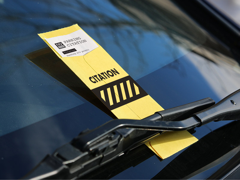
We also made sure the citation envelopes and printouts were easy to spot and to understand by the person who violated a parking rule. There's nothing more frustrating as the receiver of a ticket than a confusing citation.
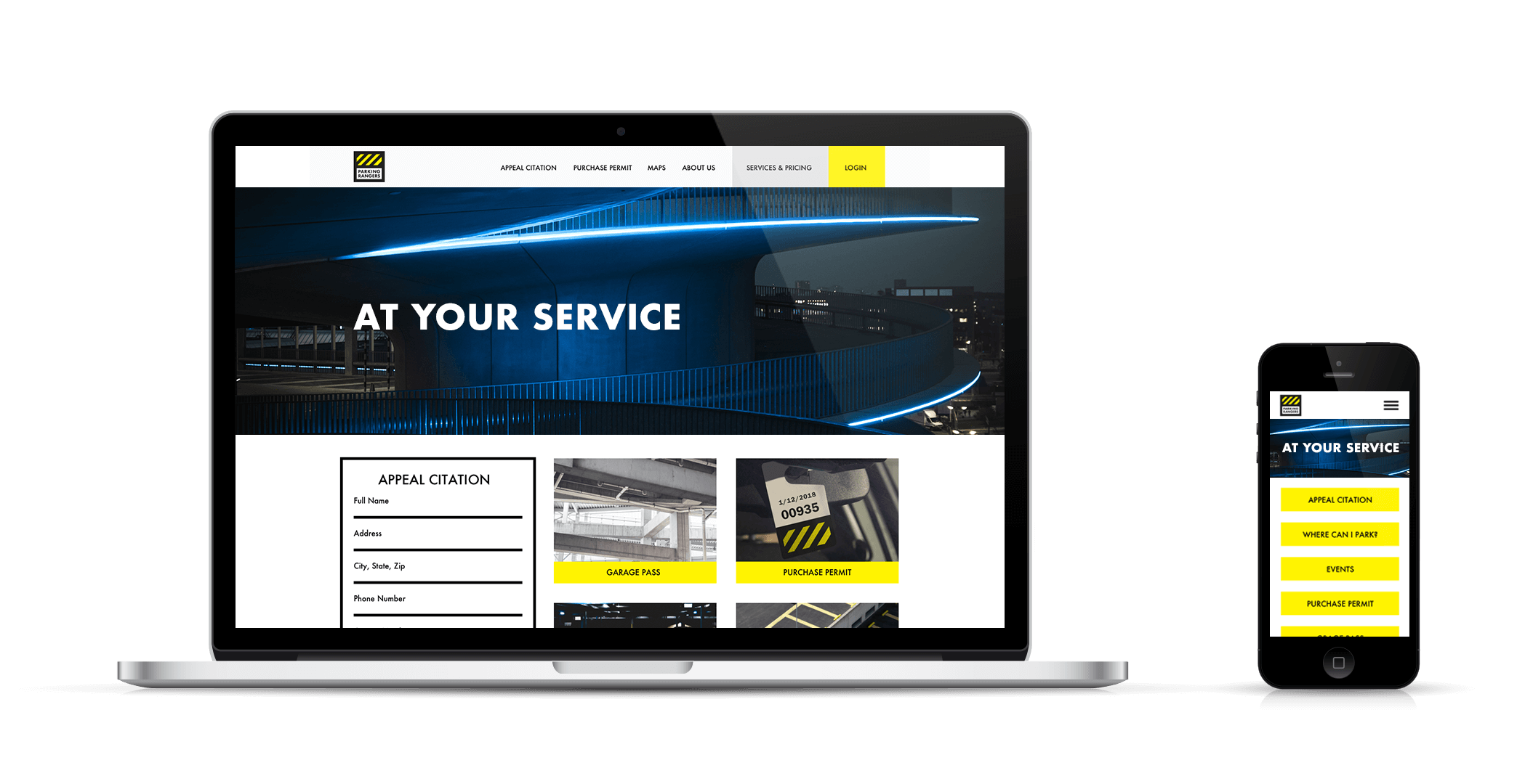
A better experience.
One way we discovered we could build up the service mentality was on the website. Looking at the user journeys, the website needed to serve three goals: citation appeals, permit purchasing, and information about the lots being serviced.
To be more approachable, we put the citation appeal form right on the home page. This way customers won't have to waste any time in finding where they can make their case. The other CTAs all go to the most viewed pages—purchasing permits/passes and getting information about lots.
One new feature was introduced as well: A card on the home page entitled, "Where can I park?" This new page will use Google Maps to help customers find the correct parking lots or garages using their GPS. They expect this feature to become a prominent point of customer delight.