Email Design & Strategy Specialist
Brands I've worked with:


Challenges with Email Marketing
Getting Started
It's the hardest part of any project. It's especially tough with email, because of all the nuances and options for technologies. What's an ESP and which one should we use? Why don't emails look exactly the same in every inbox? Should we be sending out newsletters like everyone else? How do we get people to sign up for my emails?
You may not be ready for a full design and strategy engagement, and that's fine! I have some quick DIY options or smaller services that can be the force multipliers in your first email project.
Start Your Email EnginesEmails Aren't Being Opened
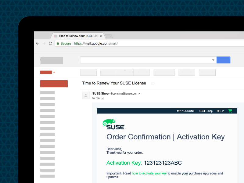
You have great content, but no one seems to open the email to see it. Sometimes your email doesn't even get delivered to the inbox. Customers have complained about "losing" emails or not getting an email they expected.
Being relevant is the biggest key to getting an email opened. Relevancy can be determined (by the reader) by the time of day the email is delivered, the timing of the email in the context of actions taken by the reader, the words/characters used in the subject line. Context is the focus of email opens—don't get stuck in thinking it's all about subject lines.
Watch this email critique to understand how context can drastically affect an email experience (and why messing this up can hurt readers' trust and discourage opens later on).
Get New Perspective on Your Current EmailEngagement and Clicks Are Low
Maybe your emails are getting opened, but the attention just doesn't cut it. People rarely click on your links or respond to your questions. You've tried adding more and more links—after all, isn't a bigger target easier to hit?
The email experience varies from business to business, but there are some general prinicples that can quickly get you on track. First, simplify. Too many links or too many choices can lead to decision overload, meaning people give up on the email altogether. Try focusing on one call to action in one email, and see if it starts getting better responses. Second, use enough contrast (in size, color, etc.) to help guide that click to that link.
Take a look at this quick redesign of a newsletter email. What can you do to your emails to improve the reader's experience? What obstacles in your emails are preventing readers from engaging with them?
Consider a CritiqueReaching Mobile Users
Emails are hard enough to get consistent in various inboxes, let alone dealing with different screen sizes. At the same time, a majority of all emails are being opened on a mobile device, so how do we make our emails get opened and read regardless of device?
The best way is using a hybrid approach, blending tables and divs, max-widths, and stacking, similar to responsive web-techniques...but I'm probably boring you with the technical details. How about an example?
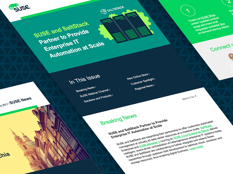
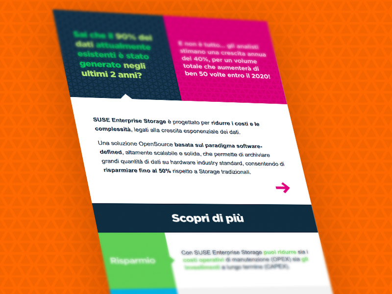
I helped renowned enterprise software company, SUSE, convert their quarterly newsletters into flexible, mobile-responsive templates to increase the reach. Check out the case study to see a comparison of the mobile experience before and after.
Going Mobile


